
Responsive Design ensures your digital presence adapts seamlessly across all devices and screen sizes, providing an optimal viewing experience for every user. Studies show that responsive web design practices can boost website traffic and improve user experience, helping increase conversions and reduce bounce rates (Design Studio UI/UX, 2025)
Who needs Responsive Design?
- E-commerce businesses seeking mobile sales growth
- Content platforms requiring cross-device accessibility
- Corporate websites serving diverse user devices
- Service providers needing consistent brand presence
- Organisations updating legacy systems
Responsive Design creates flexible layouts that automatically adjust to any screen size or device type. It ensures content remains accessible and beautiful whether viewed on desktop, tablet, or mobile devices.
Mobile-First Strategy
Prioritising mobile design as the foundation
Flexible Layouts
Creating fluid grids that adapt to any screen
Responsive Images
Optimising visuals for different device capabilities
Adaptive Content
Ensuring content readability across all platforms
Why Responsive Design Matters

✓ Mobile Usage: 64.35% of global web traffic comes from mobile devices (Exploding Topics, 2025)
✓ User Experience: 57% of users say they won’t recommend a business with a poorly designed mobile website (Wix, 2025)
✓ SEO Impact: Mobile-friendly sites are more likely to rank higher in search results due to Google’s mobile-first indexing (Opace Agency, 2025)
Benefits of Responsive Design
Companies implementing thoughtful interaction design see significant gains. For instance, 60% of consumers abandon online purchases due to poor user experience (Storyblok Research, 2022)
My Responsive Design Process
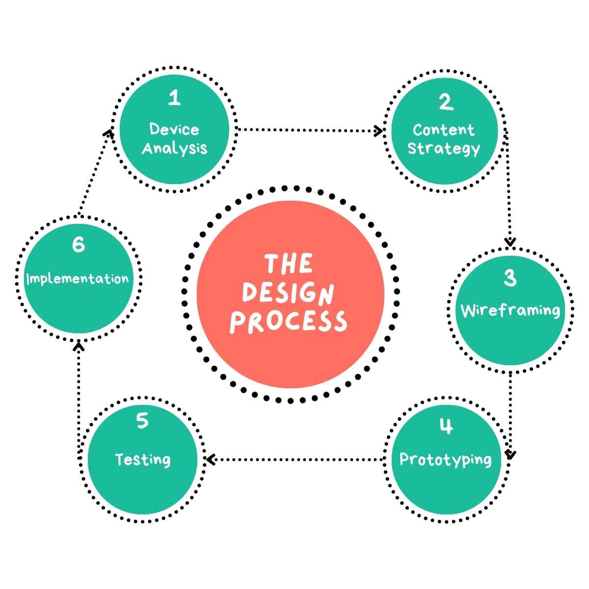
1 Device Analysis: I research the target audience’s device usage patterns and gather data on the types of devices, screen sizes, and browsing habits.
2 Content Strategy: I prioritise content for various screen sizes. I’ll determine which elements are crucial for each breakpoint and how they should be arranged.
3 Wireframing: I create adaptive wireframes for key breakpoints, developing low-fidelity layouts that showcase how my design will adapt.
4 Prototyping: I then develop interactive, responsive prototypes that demonstrate how my design will behave.
5 Testing: I conduct thorough cross-device and cross-browser testing.
6 Implementation: I provide detailed guidelines for responsive development including specific instructions on breakpoints, layout changes, and responsive behaviour.
Why Choose UserFirst UX for Your Responsive Design Needs?
Mobile-First Excellence
Optimising experiences for smartphones and tablets as the primary platform.
Performance Focused
Creating fast-loading designs that work efficiently across all devices.
Cross-Device Expertise
Maintaining consistent experiences from desktop to mobile devices.
Technical Knowledge
Implementing advanced responsive techniques for seamless adaptability.